 Home
HomeSpatial Heat Map Plotting Using R
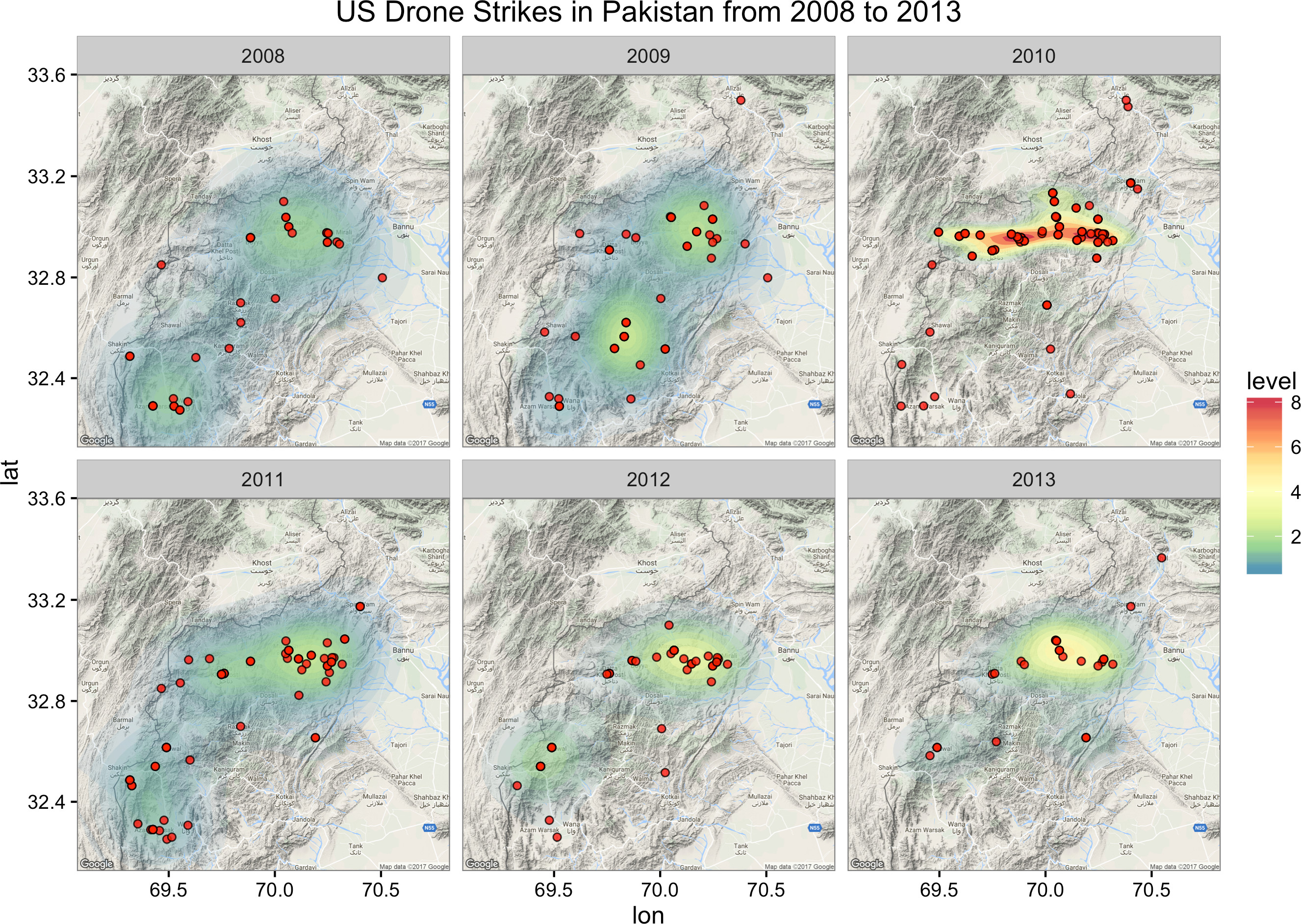
This tutorial explores the use of two R packages: ggplot2 and ggmap, for visualizing the distribution of spatiotemporal events. To this end, we make use of spatial heat maps, i.e., a heat map that is overlaid on a geographical map where the events actually took place. The data used in this tutorial are the drone strike incidents (i.e., the “events”) in Northwest Pakistan conducted by the U.S. intelligence as part of its extensive and prolonged War on Terror. Data were collected by the Bureau of Investigative Journalism from 2004 to 2013. Source code of the tutorial is available on GitHub as well as the dataset.
We first need to load the necessary R libraries that we are going to use and the data file. We also want to subset the events that happened in 2008 or later (since there are more data points then).
library(ggplot2)
library(ggmap)
library(RColorBrewer) # for color selection
## Read the input spatiotemporal data
drone.data <- read.csv(file="./data/drone/drone_strikes.csv")
## Break down by year
year <- vector()
for(i in 1:nrow(drone.data)) {
 dateStr <- toString(drone.data$Date[i])
 dateStrSplit <- strsplit(dateStr, "/")[[1]]
 year[i] <- as.numeric(dateStrSplit[3])
}
## Create a year attribute
drone.data$year <- year
## Subset the data by year
subset.drone.data <- subset(drone.data, year >= 2008)
## Convert year to factor
subset.drone.data$year <- as.factor(subset.drone.data$year)
We then draw a rectangular map (retrieved from Google Maps via the function get_map) centered at the mean longitude and latitude coordinates of all the events. Because the retrieved map is a raster object, we have to convert it into a ggplot object in order for it to be plottable.
## Specify a map with center at the center of all the coordinates
mean.longitude <- mean(subset.drone.data$Longitude)
mean.latitude <- mean(subset.drone.data$Latitude)
drone.map <- get_map(location = c(mean.longitude, mean.latitude), zoom = 9, scale = 2)
## Convert into ggmap object
drone.map <- ggmap(drone.map, extent="device", legend="none")
We now visualize the density of the events over a 2D space by adding polygonal density layers over the map (using the stat_density2d function). The density is described by the longitude and latitude coordinates of the events themselves. The density layers are “filled”, i.e., shaded, according to their density level (which is automatically calculated using the ..level.. parameter). To add more aesthetic, the transparency level (given by the parameter alpha) of each layer is also automatically tuned according to the calculated density level. We finally color the density layers (or contours) using a defined spectrum of colors smoothed out by gradient (supported by the RColorBrewer package).
## Plot a heat map layer: Polygons with fill colors based on
## relative frequency of events
drone.map <- drone.map + stat_density2d(data=subset.drone.data,
 aes(x=Longitude, y=Latitude, fill=..level.., alpha=..level..), geom="polygon")
## Define the spectral colors to fill the density contours
drone.map <- drone.map + scale_fill_gradientn(colours=rev(brewer.pal(7, "Spectral")))
We next illustrate the strike locations using the geom_point function of the ggplot2 package. We depict those as red circles (shape=21, see more shapes here) and give them some level of transparency (alpha=0.8). We then disable distracting legends and give our map a title.
## Add the strike points, color them red and define round shape
drone.map <- drone.map + geom_point(data=subset.drone.data,
 aes(x=Longitude, y=Latitude), fill="red", shape=21, alpha=0.8)
## Remove any legends
drone.map <- drone.map + guides(size=FALSE, alpha = FALSE)
## Give the map a title
drone.map <- drone.map + ggtitle("US Drone Strikes in Pakistan from 2008 to 2013")
Finally, we split the events up yearly using the facet_wrap function to produce multiple “subplots” or facets, where each is a yearly data, and plot the distribution of events over the years.
## Plot strikes by each year
drone.map <- drone.map + facet_wrap(~year)
print(drone.map) # this is necessary to display the plot
This is what the resulted heat maps look like. We observe that year 2010 seems to have more densely located (and probably more intense) strikes than the rest. Check the reality here for yourself!